Cruise & Brews
Exploring New Brews in Southern Indiana
Exploring New Brews in Southern Indiana
Exploring New Brews in Southern Indiana
project scope
branding / visual identity / packaging
my role
Contracted Brand Designer
Contracted Brand Designer
the challenge
cruise & brews is a drive-thru coffee shop in seymour, indiana with deep ties to its community. when the business came for a rebrand, it was still operating as "the coffee company," a name that described what they sold but said nothing about who they were. a full rebrand was needed: new name, new visual identity, new packaging, and new merchandise.
the strategy
"cruise & brews" emerged from the strategic insight that seymour is known as the "crossroads of southern indiana" due to it being defined by movement, connections, and journeys. "cruise" taps into that geography (and the local car culture), while "brews" anchors it to the product. together, they create a brand promise: this is a place to explore, to be on the move, to enjoy the journey. the name caused the visual strategy to focus on the product sold but the journey to receiving it.
brainstorming
brainstorming
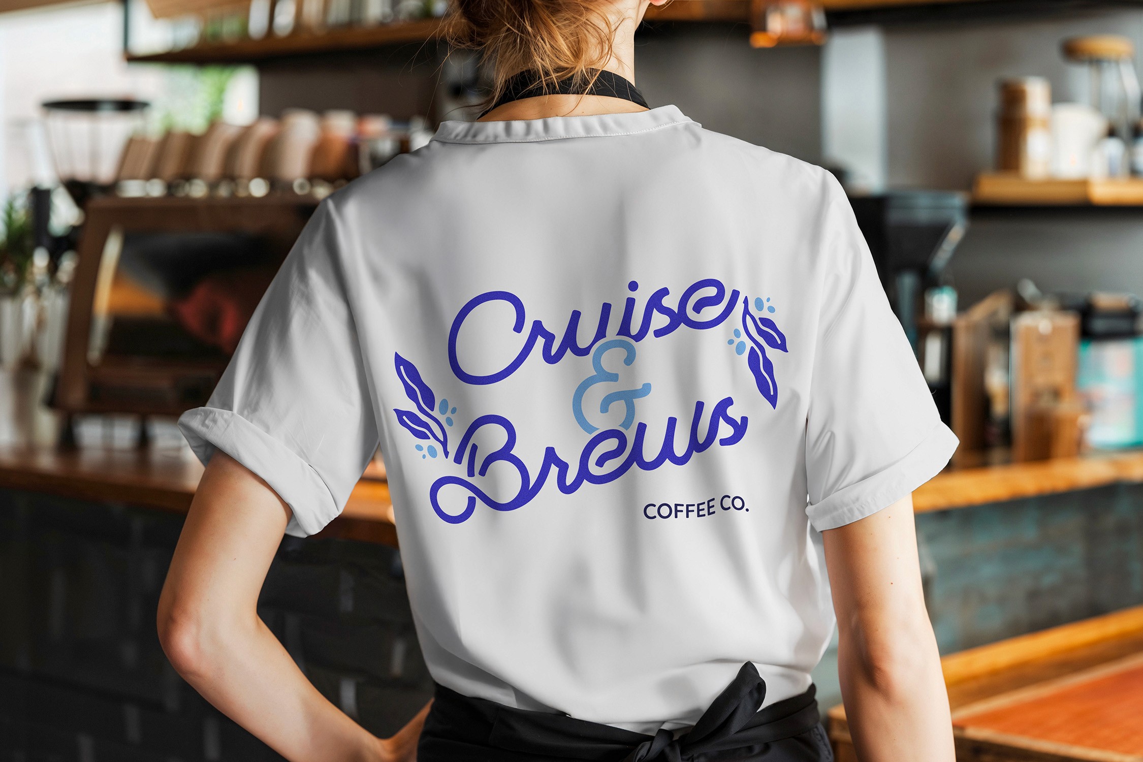
sketches showcasing the brainstorming of the identity suite. the name of cruise & brews was chosen due to how it relates to the theme of travel whether it be by car or train and the brews of coffee the business offers.
sketches showcasing the brainstorming of the identity suite. the name of cruise & brews was chosen due to how it relates to the theme of travel whether it be by car or train and the brews of coffee the business offers.
brainstorming
sketches showcasing the brainstorming of the identity suite. the name of cruise & brews was chosen due to how it relates to the theme of travel whether it be by car or train and the brews of coffee the business offers.
Face of the brand
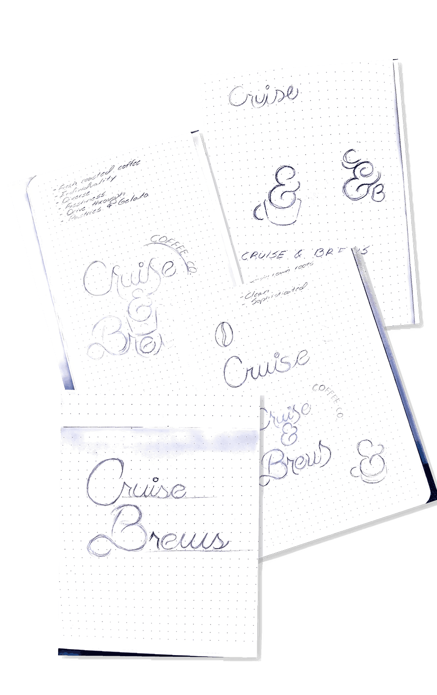
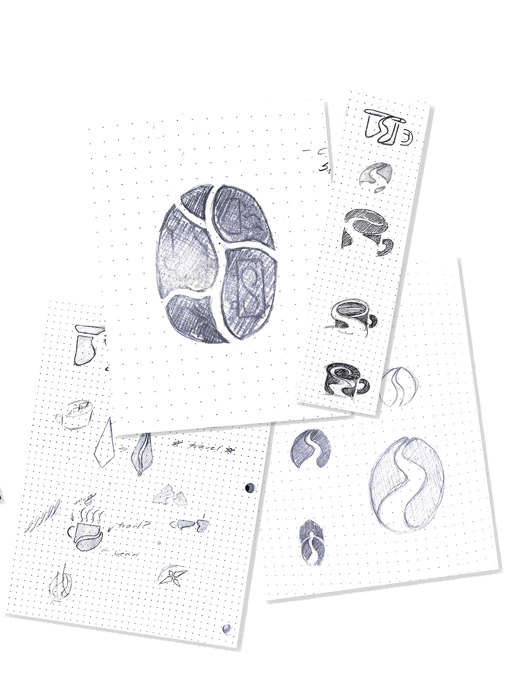
coffee visuals such as the coffee bean and plant are focus points and then expanded upon with seymour's history with trains. the identity was built around the themes of travel and discovery, drawing from imagery of trains and routes specifically. simple enough for a community staple and small business but complex enough if expansion is in the company's plans.
Face of the brand
coffee visuals such as the coffee bean and plant are focus points and then expanded upon with seymour's history with trains. the identity was built around the themes of travel and discovery, drawing from imagery of trains and routes specifically. simple enough for a community staple and small business but complex enough if expansion is in the company's plans.
coffee visuals such as the coffee bean and plant are focus points and then expanded upon with seymour's history with trains. the identity was built around the themes of travel and discovery, drawing from imagery of trains and routes specifically. simple enough for a community staple and small business but complex enough if expansion is in the company's plans.
Illustration
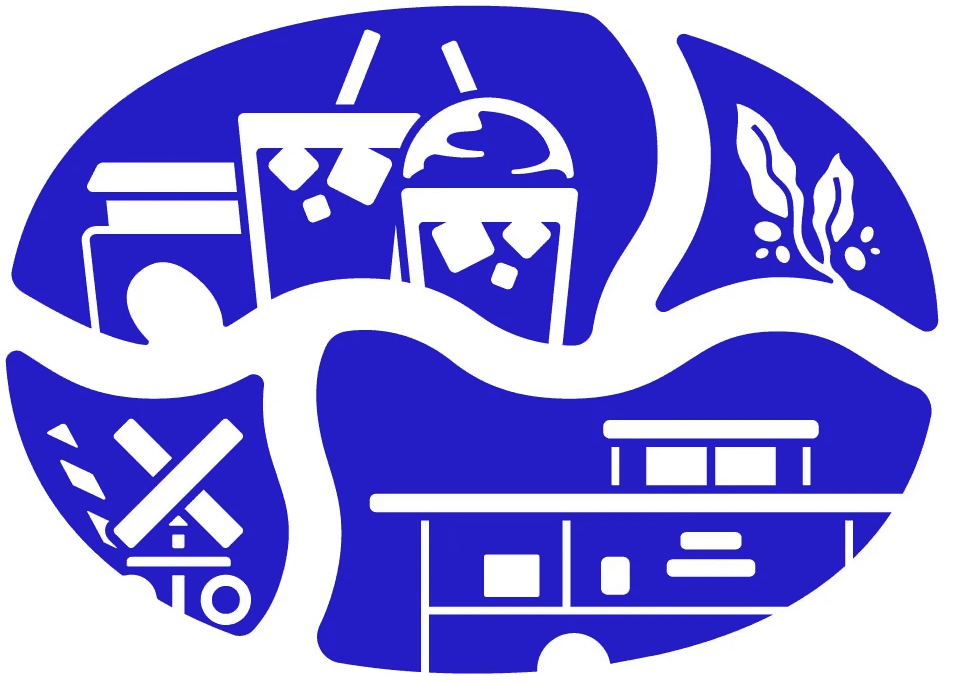
the logo was used to act as a frame to showcase more of cruise & brews identity. the railroad crossing, the train caboose, the sense of being at an intersection of paths all tie back to seymour and its landmarks. the illustration system was designed to be location-specific in a way that could evolve: the bottom two sections of the primary illustration reference seymour imagery directly, but the system was built so that future locations could adapt those sections to reflect their own communities. it's a brand that scales with intention.
the logo was used to act as a frame to showcase more of cruise & brews identity. the railroad crossing, the train caboose, the sense of being at an intersection of paths all tie back to seymour and its landmarks. the illustration system was designed to be location-specific in a way that could evolve: the bottom two sections of the primary illustration reference seymour imagery directly, but the system was built so that future locations could adapt those sections to reflect their own communities. it's a brand that scales with intention.
Illustration
the logo was used to act as a frame to showcase more of cruise & brews identity. the railroad crossing, the train caboose, the sense of being at an intersection of paths all tie back to seymour and its landmarks. the illustration system was designed to be location-specific in a way that could evolve: the bottom two sections of the primary illustration reference seymour imagery directly, but the system was built so that future locations could adapt those sections to reflect their own communities. it's a brand that scales with intention.
Packaging
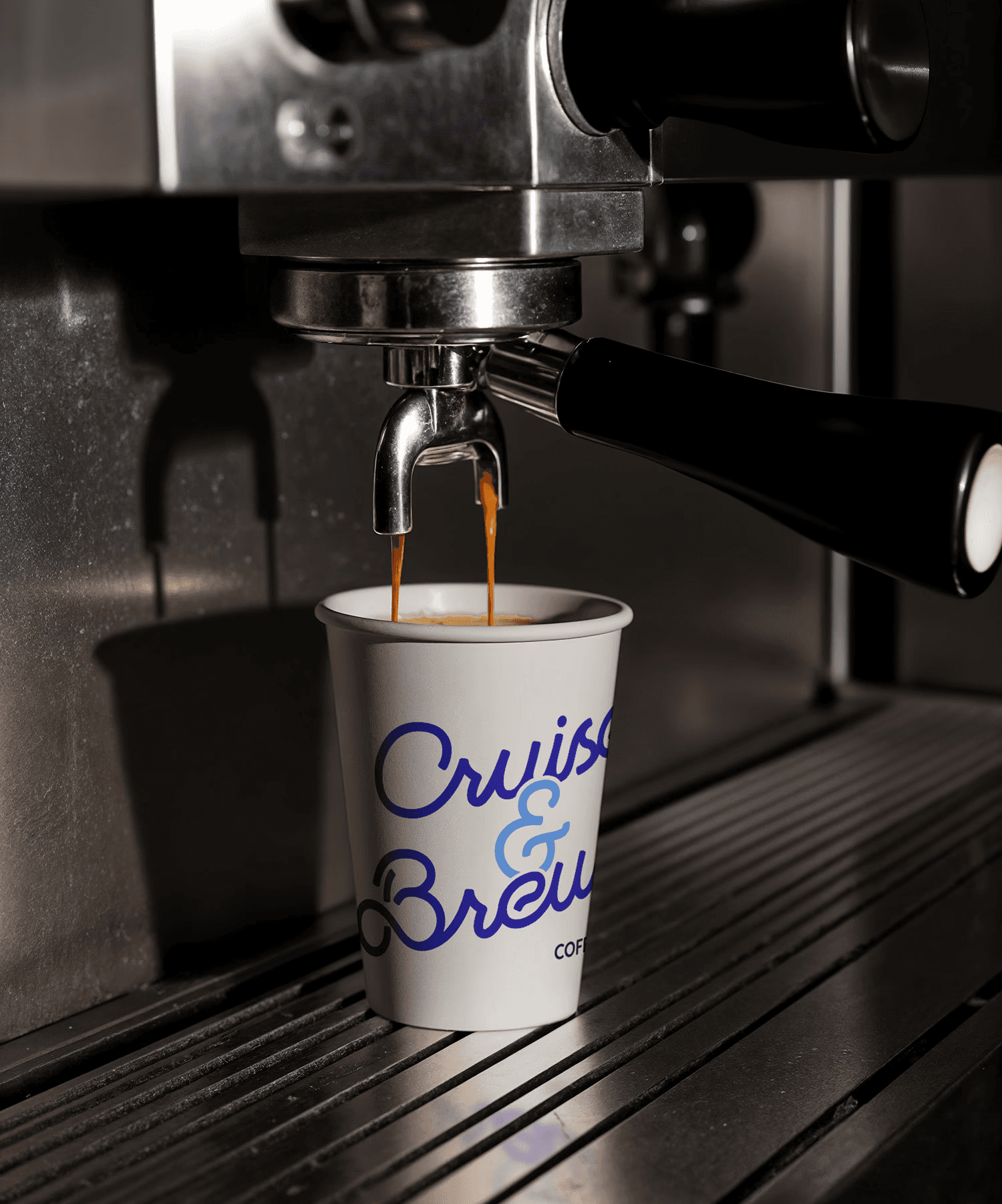
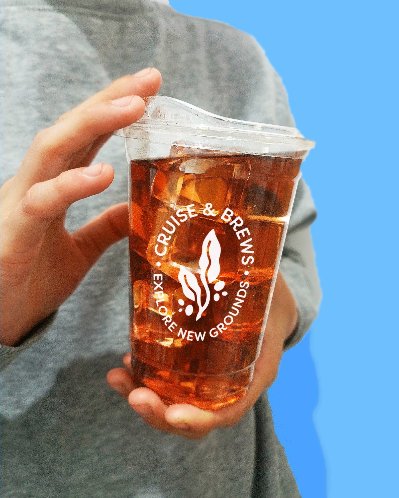
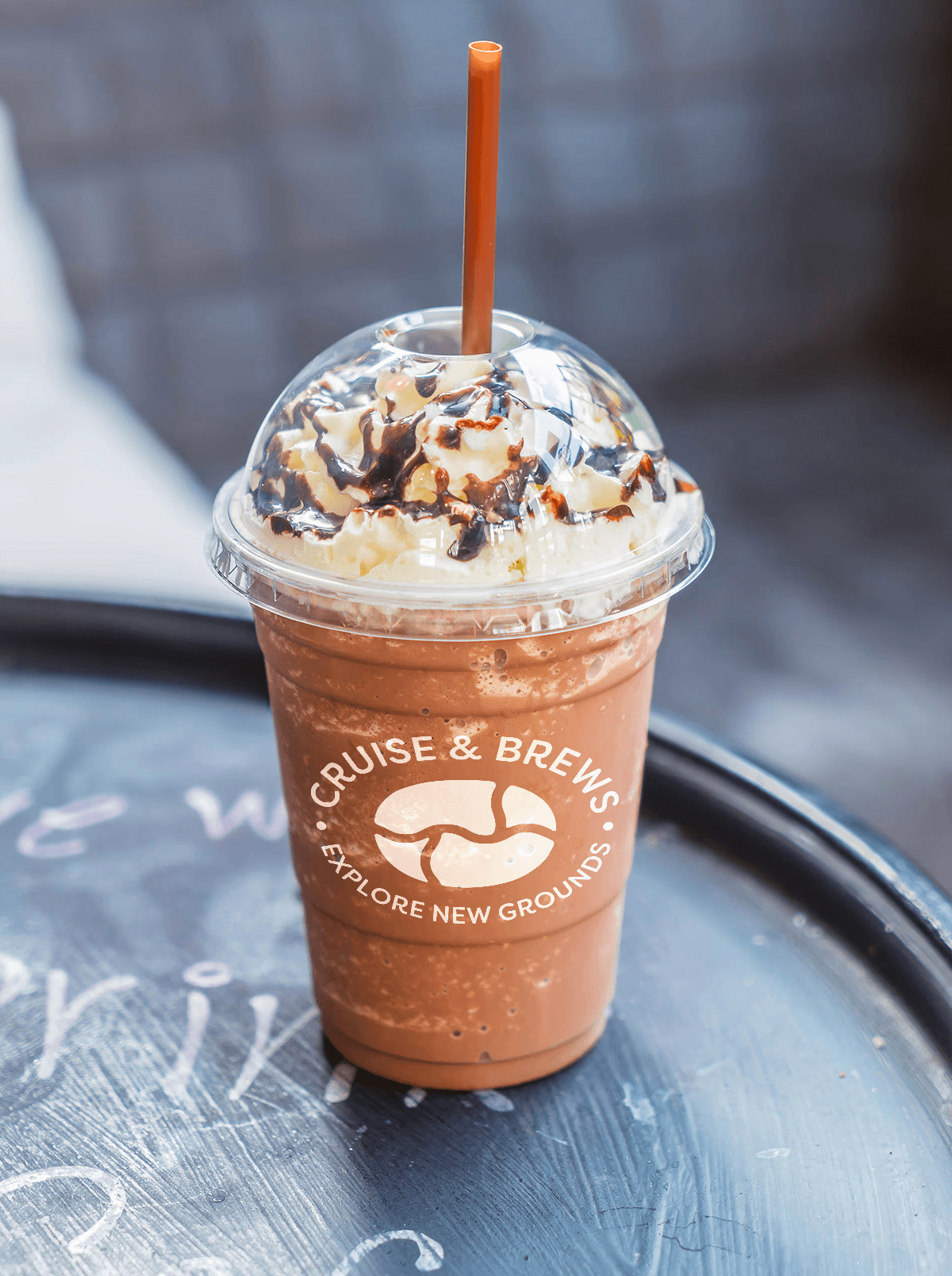
the packaging brief was to carry the "explore new grounds" message all the way through to the cup in someone's hand. coffee as a journey: different roasts, different origins, different experiences.
the packaging brief was to carry the "explore new grounds" message all the way through to the cup in someone's hand. coffee as a journey: different roasts, different origins, different experiences.
Packaging
the packaging brief was to carry the "explore new grounds" message all the way through to the cup in someone's hand. coffee as a journey: different roasts, different origins, different experiences.
Merchandise
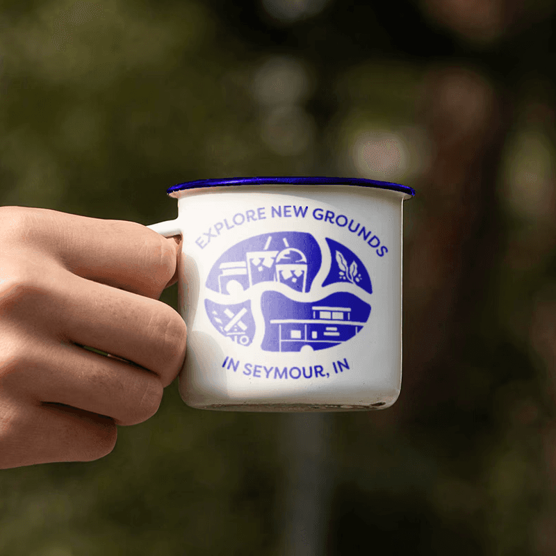
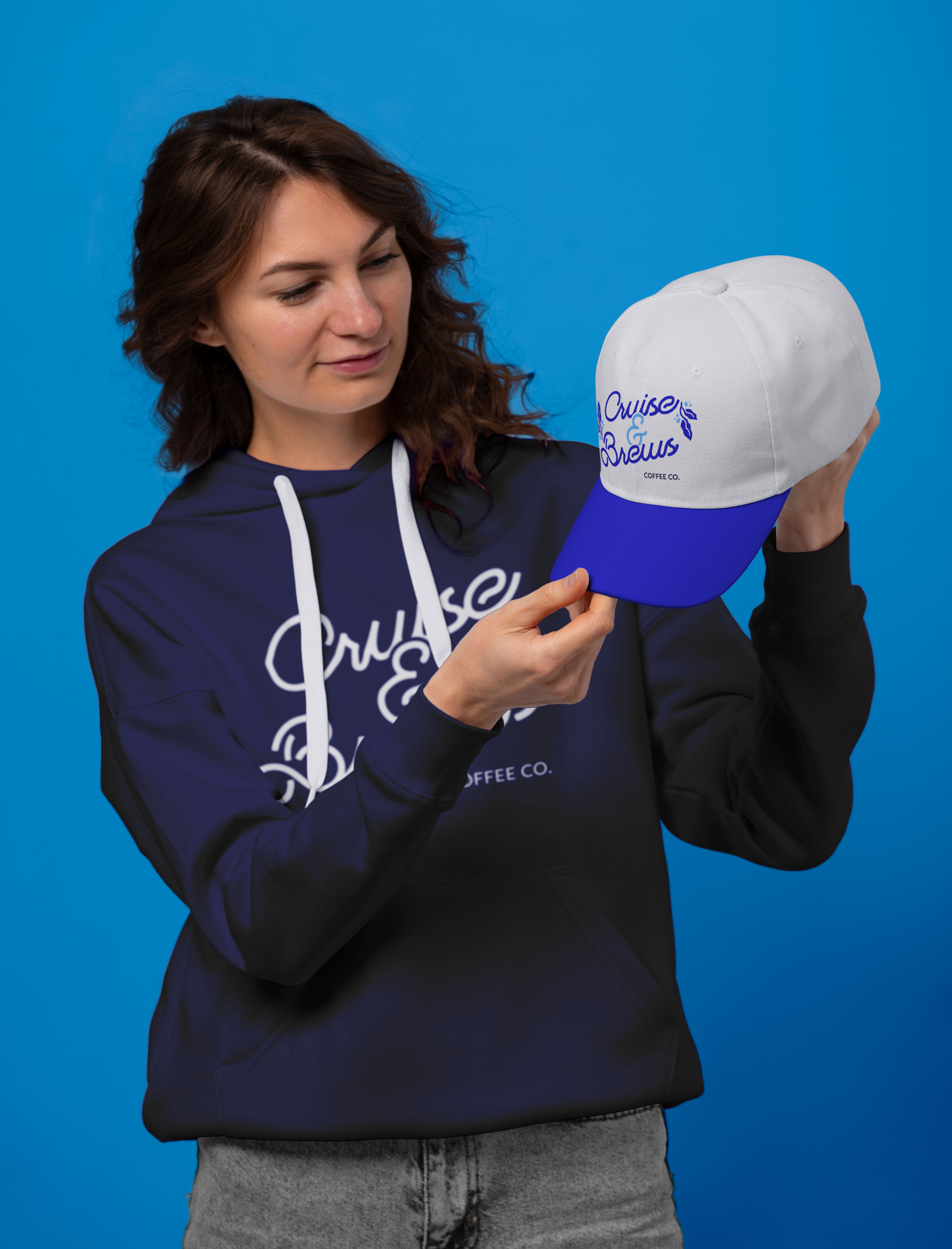
the connection of community of seymour is at the heart of cruise & brews and merchandise was crafted for locals, visitors, and tourists alike can come and support the beloved business. the people who buy a cruise & brews hat or tee are signaling something about their relationship to seymour and their pride in it.
the connection of community of seymour is at the heart of cruise & brews and merchandise was crafted for locals, visitors, and tourists alike can come and support the beloved business. the people who buy a cruise & brews hat or tee are signaling something about their relationship to seymour and their pride in it.
Merchandise
the connection of community of seymour is at the heart of cruise & brews and merchandise was crafted for locals, visitors, and tourists alike can come and support the beloved business. the people who buy a cruise & brews hat or tee are signaling something about their relationship to seymour and their pride in it.
the results
rebrands require earning trust in both directions with the client (who is letting go of something familiar) and with their existing customers (who have an attachment to what it was). the best way to do that is to make the new identity feel like an evolution rather than a replacement: something that honors where the business came from while giving it room to grow. "cruise & brews" does that. the name change was a risk; the design work made it feel inevitable.



Cruise & Brews
Exploring New Brews in Southern Indiana
Exploring New Brews in Southern Indiana
Exploring New Brews in Southern Indiana
project scope
branding / visual identity / packaging
my role
Contracted Brand Designer
Contracted Brand Designer
the challenge
cruise & brews is a drive-thru coffee shop in seymour, indiana with deep ties to its community. when the business came for a rebrand, it was still operating as "the coffee company," a name that described what they sold but said nothing about who they were. a full rebrand was needed: new name, new visual identity, new packaging, and new merchandise.
the strategy
"cruise & brews" emerged from the strategic insight that seymour is known as the "crossroads of southern indiana" due to it being defined by movement, connections, and journeys. "cruise" taps into that geography (and the local car culture), while "brews" anchors it to the product. together, they create a brand promise: this is a place to explore, to be on the move, to enjoy the journey. the name caused the visual strategy to focus on the product sold but the journey to receiving it.
brainstorming
brainstorming
sketches showcasing the brainstorming of the identity suite. the name of cruise & brews was chosen due to how it relates to the theme of travel whether it be by car or train and the brews of coffee the business offers.
sketches showcasing the brainstorming of the identity suite. the name of cruise & brews was chosen due to how it relates to the theme of travel whether it be by car or train and the brews of coffee the business offers.
brainstorming
sketches showcasing the brainstorming of the identity suite. the name of cruise & brews was chosen due to how it relates to the theme of travel whether it be by car or train and the brews of coffee the business offers.
Face of the brand
coffee visuals such as the coffee bean and plant are focus points and then expanded upon with seymour's history with trains. the identity was built around the themes of travel and discovery, drawing from imagery of trains and routes specifically. simple enough for a community staple and small business but complex enough if expansion is in the company's plans.
Face of the brand
coffee visuals such as the coffee bean and plant are focus points and then expanded upon with seymour's history with trains. the identity was built around the themes of travel and discovery, drawing from imagery of trains and routes specifically. simple enough for a community staple and small business but complex enough if expansion is in the company's plans.
coffee visuals such as the coffee bean and plant are focus points and then expanded upon with seymour's history with trains. the identity was built around the themes of travel and discovery, drawing from imagery of trains and routes specifically. simple enough for a community staple and small business but complex enough if expansion is in the company's plans.
Illustration
the logo was used to act as a frame to showcase more of cruise & brews identity. the railroad crossing, the train caboose, the sense of being at an intersection of paths all tie back to seymour and its landmarks. the illustration system was designed to be location-specific in a way that could evolve: the bottom two sections of the primary illustration reference seymour imagery directly, but the system was built so that future locations could adapt those sections to reflect their own communities. it's a brand that scales with intention.
the logo was used to act as a frame to showcase more of cruise & brews identity. the railroad crossing, the train caboose, the sense of being at an intersection of paths all tie back to seymour and its landmarks. the illustration system was designed to be location-specific in a way that could evolve: the bottom two sections of the primary illustration reference seymour imagery directly, but the system was built so that future locations could adapt those sections to reflect their own communities. it's a brand that scales with intention.
Illustration
the logo was used to act as a frame to showcase more of cruise & brews identity. the railroad crossing, the train caboose, the sense of being at an intersection of paths all tie back to seymour and its landmarks. the illustration system was designed to be location-specific in a way that could evolve: the bottom two sections of the primary illustration reference seymour imagery directly, but the system was built so that future locations could adapt those sections to reflect their own communities. it's a brand that scales with intention.
Packaging
the packaging brief was to carry the "explore new grounds" message all the way through to the cup in someone's hand. coffee as a journey: different roasts, different origins, different experiences.
the packaging brief was to carry the "explore new grounds" message all the way through to the cup in someone's hand. coffee as a journey: different roasts, different origins, different experiences.
Packaging
the packaging brief was to carry the "explore new grounds" message all the way through to the cup in someone's hand. coffee as a journey: different roasts, different origins, different experiences.
Merchandise
the connection of community of seymour is at the heart of cruise & brews and merchandise was crafted for locals, visitors, and tourists alike can come and support the beloved business. the people who buy a cruise & brews hat or tee are signaling something about their relationship to seymour and their pride in it.
the connection of community of seymour is at the heart of cruise & brews and merchandise was crafted for locals, visitors, and tourists alike can come and support the beloved business. the people who buy a cruise & brews hat or tee are signaling something about their relationship to seymour and their pride in it.
Merchandise
the connection of community of seymour is at the heart of cruise & brews and merchandise was crafted for locals, visitors, and tourists alike can come and support the beloved business. the people who buy a cruise & brews hat or tee are signaling something about their relationship to seymour and their pride in it.
the results
rebrands require earning trust in both directions with the client (who is letting go of something familiar) and with their existing customers (who have an attachment to what it was). the best way to do that is to make the new identity feel like an evolution rather than a replacement: something that honors where the business came from while giving it room to grow. "cruise & brews" does that. the name change was a risk; the design work made it feel inevitable.
Cruise & Brews
Exploring New Brews in Southern Indiana
Exploring New Brews in Southern Indiana
Exploring New Brews in Southern Indiana
project scope
branding / visual identity / packaging
my role
Contracted Brand Designer
Contracted Brand Designer
the challenge
cruise & brews is a drive-thru coffee shop in seymour, indiana with deep ties to its community. when the business came for a rebrand, it was still operating as "the coffee company," a name that described what they sold but said nothing about who they were. a full rebrand was needed: new name, new visual identity, new packaging, and new merchandise.
the strategy
"cruise & brews" emerged from the strategic insight that seymour is known as the "crossroads of southern indiana" due to it being defined by movement, connections, and journeys. "cruise" taps into that geography (and the local car culture), while "brews" anchors it to the product. together, they create a brand promise: this is a place to explore, to be on the move, to enjoy the journey. the name caused the visual strategy to focus on the product sold but the journey to receiving it.
brainstorming
brainstorming
sketches showcasing the brainstorming of the identity suite. the name of cruise & brews was chosen due to how it relates to the theme of travel whether it be by car or train and the brews of coffee the business offers.
sketches showcasing the brainstorming of the identity suite. the name of cruise & brews was chosen due to how it relates to the theme of travel whether it be by car or train and the brews of coffee the business offers.
brainstorming
sketches showcasing the brainstorming of the identity suite. the name of cruise & brews was chosen due to how it relates to the theme of travel whether it be by car or train and the brews of coffee the business offers.
Face of the brand
coffee visuals such as the coffee bean and plant are focus points and then expanded upon with seymour's history with trains. the identity was built around the themes of travel and discovery, drawing from imagery of trains and routes specifically. simple enough for a community staple and small business but complex enough if expansion is in the company's plans.
Face of the brand
coffee visuals such as the coffee bean and plant are focus points and then expanded upon with seymour's history with trains. the identity was built around the themes of travel and discovery, drawing from imagery of trains and routes specifically. simple enough for a community staple and small business but complex enough if expansion is in the company's plans.
coffee visuals such as the coffee bean and plant are focus points and then expanded upon with seymour's history with trains. the identity was built around the themes of travel and discovery, drawing from imagery of trains and routes specifically. simple enough for a community staple and small business but complex enough if expansion is in the company's plans.
Illustration
the logo was used to act as a frame to showcase more of cruise & brews identity. the railroad crossing, the train caboose, the sense of being at an intersection of paths all tie back to seymour and its landmarks. the illustration system was designed to be location-specific in a way that could evolve: the bottom two sections of the primary illustration reference seymour imagery directly, but the system was built so that future locations could adapt those sections to reflect their own communities. it's a brand that scales with intention.
the logo was used to act as a frame to showcase more of cruise & brews identity. the railroad crossing, the train caboose, the sense of being at an intersection of paths all tie back to seymour and its landmarks. the illustration system was designed to be location-specific in a way that could evolve: the bottom two sections of the primary illustration reference seymour imagery directly, but the system was built so that future locations could adapt those sections to reflect their own communities. it's a brand that scales with intention.
Illustration
the logo was used to act as a frame to showcase more of cruise & brews identity. the railroad crossing, the train caboose, the sense of being at an intersection of paths all tie back to seymour and its landmarks. the illustration system was designed to be location-specific in a way that could evolve: the bottom two sections of the primary illustration reference seymour imagery directly, but the system was built so that future locations could adapt those sections to reflect their own communities. it's a brand that scales with intention.
Packaging
the packaging brief was to carry the "explore new grounds" message all the way through to the cup in someone's hand. coffee as a journey: different roasts, different origins, different experiences.
the packaging brief was to carry the "explore new grounds" message all the way through to the cup in someone's hand. coffee as a journey: different roasts, different origins, different experiences.
Packaging
the packaging brief was to carry the "explore new grounds" message all the way through to the cup in someone's hand. coffee as a journey: different roasts, different origins, different experiences.
Merchandise
the connection of community of seymour is at the heart of cruise & brews and merchandise was crafted for locals, visitors, and tourists alike can come and support the beloved business. the people who buy a cruise & brews hat or tee are signaling something about their relationship to seymour and their pride in it.
the connection of community of seymour is at the heart of cruise & brews and merchandise was crafted for locals, visitors, and tourists alike can come and support the beloved business. the people who buy a cruise & brews hat or tee are signaling something about their relationship to seymour and their pride in it.
Merchandise
the connection of community of seymour is at the heart of cruise & brews and merchandise was crafted for locals, visitors, and tourists alike can come and support the beloved business. the people who buy a cruise & brews hat or tee are signaling something about their relationship to seymour and their pride in it.
the results
rebrands require earning trust in both directions with the client (who is letting go of something familiar) and with their existing customers (who have an attachment to what it was). the best way to do that is to make the new identity feel like an evolution rather than a replacement: something that honors where the business came from while giving it room to grow. "cruise & brews" does that. the name change was a risk; the design work made it feel inevitable.