Schwätzer's
honoring german heritage one bratwurst at a time
honoring german heritage one bratwurst at a time
honoring german heritage one bratwurst at a time
project scope
brand identity & packaging
my role
Visual Designer
Visual Designer
year
2023
recognition
recognition
the challenge
schwätzer's is a local german restaurant in seymour, indiana, proud of their german roots. they specialized in hand-crafted german cuisine and promote their heritage with nightly german classes. the food truck extension of the brand needed to carry all of that weight while solving a specific design problem: german culture is closely associated with beer and alcohol, but the truck couldn't serve it.
the strategy
the goal was to develop an overall visual identity for the food truck that resonates with the restaurant's culinary style and ethos. this extended the restaurant's branding to the to-go containers, ensuring the visuals seamlessly translate to the truck's compact canvas.
brainstorming
brainstorming
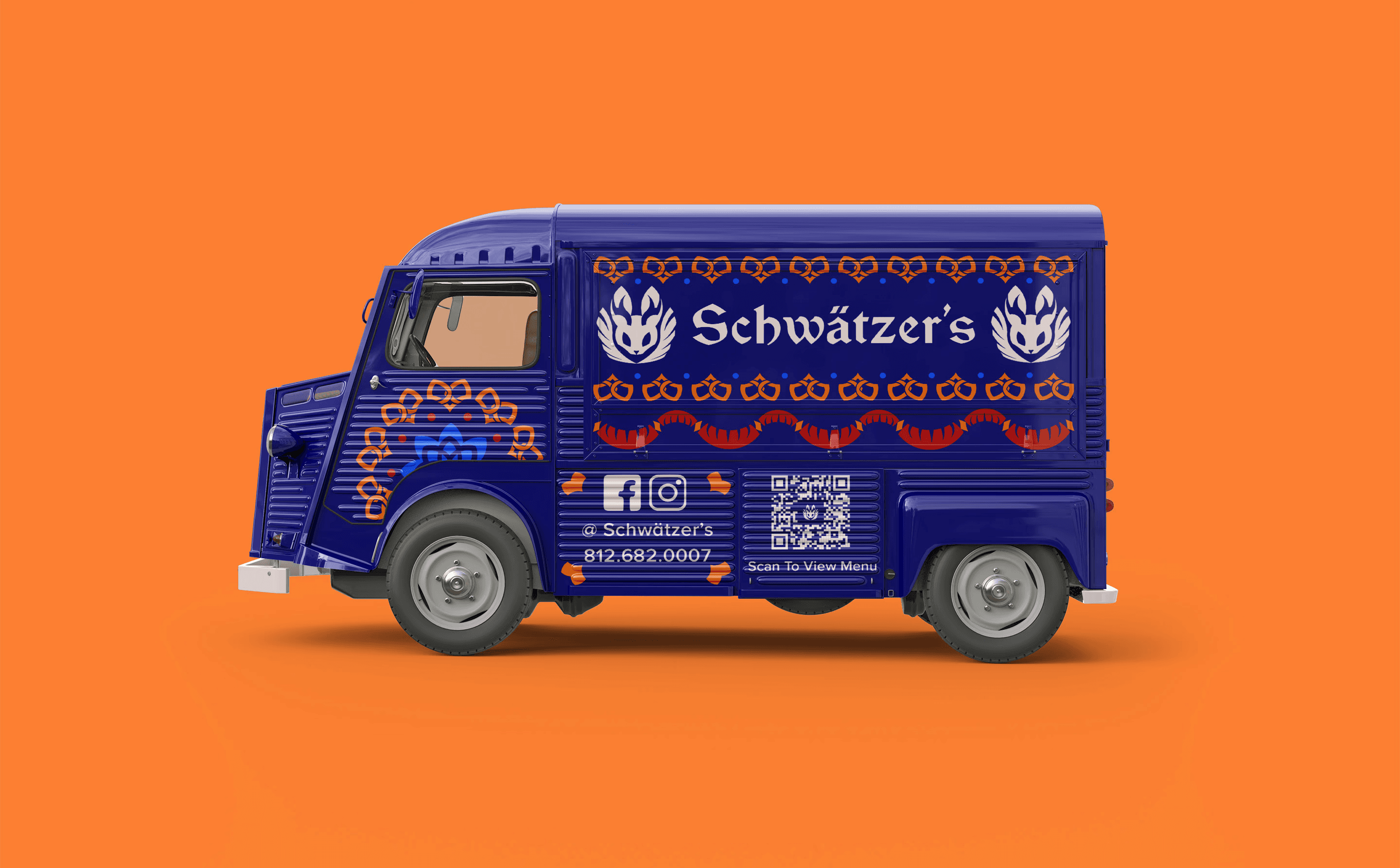
sketches showcasing the brainstorming for a logomark, brand illustrations, and digital menu layouts. the main inspiration for the brand was german folk art which would highlight the heritage the business is so proud of.
sketches showcasing the brainstorming for a logomark, brand illustrations, and digital menu layouts. the main inspiration for the brand was german folk art which would highlight the heritage the business is so proud of.
brainstorming
sketches showcasing the brainstorming for a logomark, brand illustrations, and digital menu layouts. the main inspiration for the brand was german folk art which would highlight the heritage the business is so proud of.



Face of the brand
Face of the brand
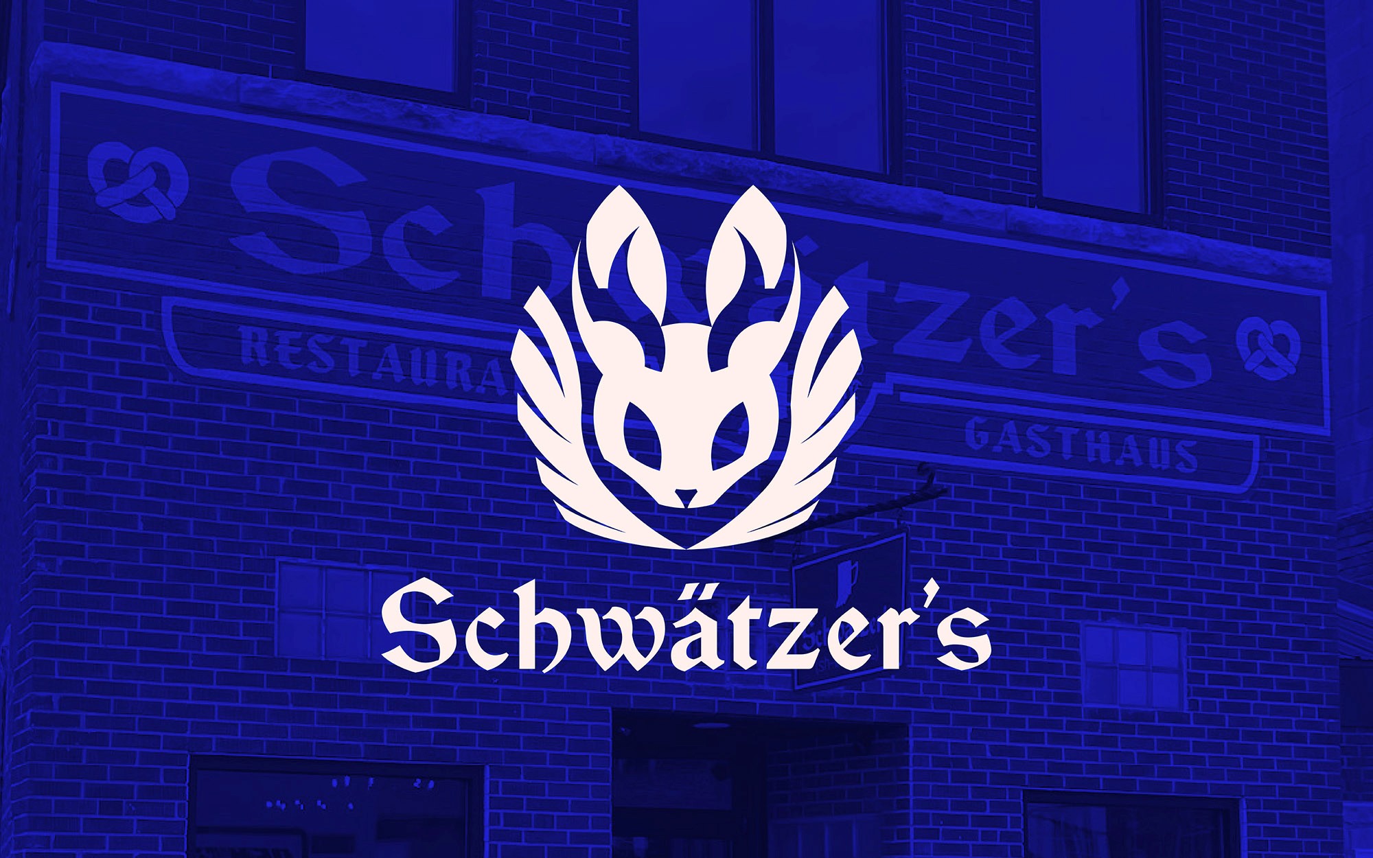
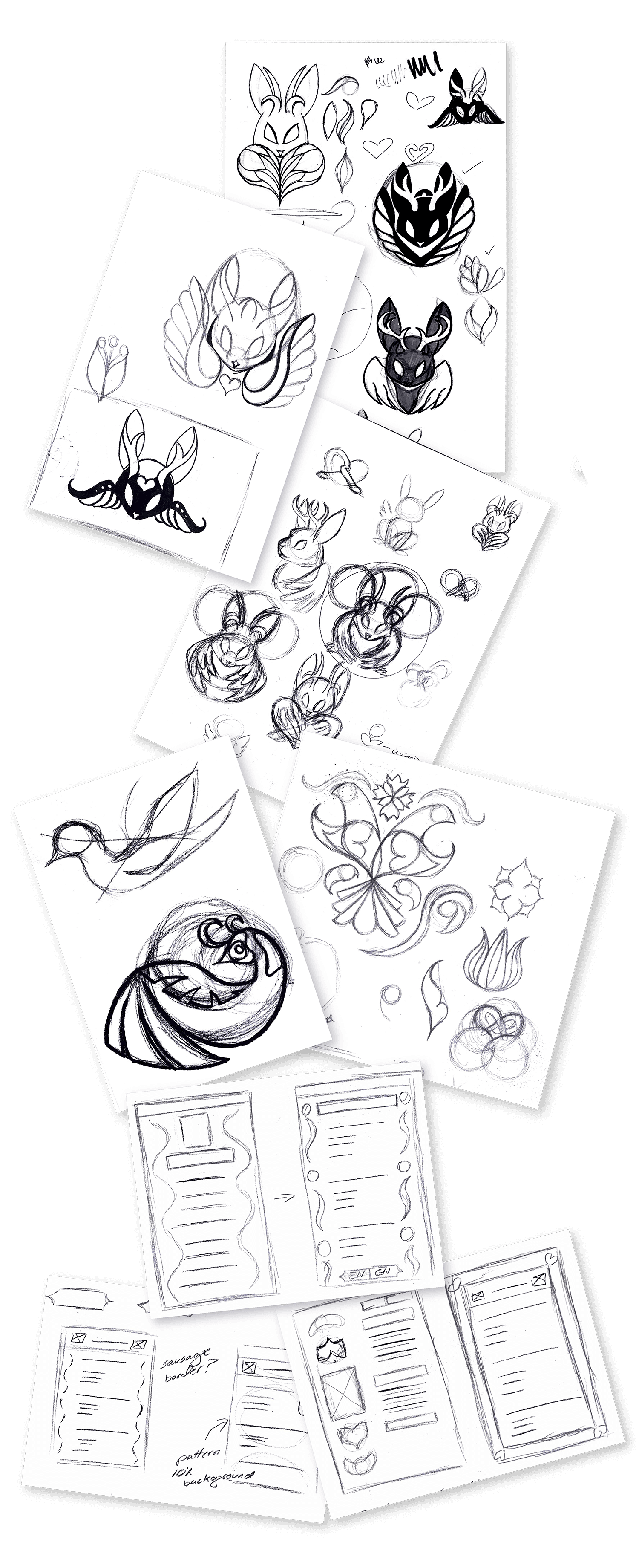
the central creative decision of this project was the logomark. german folklore offered a perfect option: the wolpertinger, a mythical creature made up of woodland animals such as deer, hares, pheasants that supposedly resulted from woodland creatures reproducing. it's culturally specific, visually interesting, and has a built-in warmth and uniqueness that fits a restaurant brand perfectly. the wolpertinger gave the brand something most food trucks don't have: a story. when customers ask about the creature on their packaging, the answer teaches them something real about german culture.
the central creative decision of this project was the logomark. german folklore offered a perfect option: the wolpertinger, a mythical creature made up of woodland animals such as deer, hares, pheasants that supposedly resulted from woodland creatures reproducing. it's culturally specific, visually interesting, and has a built-in warmth and uniqueness that fits a restaurant brand perfectly. the wolpertinger gave the brand something most food trucks don't have: a story. when customers ask about the creature on their packaging, the answer teaches them something real about german culture.
Illustration
beyond the logomark, a set of folk art-inspired illustrations were developed from specific cultural imagery: • distelfink - double good luck • pretzel & bratwurst - cuisine • cornflower - resilience & hope • heart - love, affection, & regional pride each illustration was designed to feel hand-crafted and more like folk art than modern commercial illustration to reinforce the restaurant's connection to tradition over trend.
beyond the logomark, a set of folk art-inspired illustrations were developed from specific cultural imagery: • distelfink - double good luck • pretzel & bratwurst - cuisine • cornflower - resilience & hope • heart - love, affection, & regional pride each illustration was designed to feel hand-crafted and more like folk art than modern commercial illustration to reinforce the restaurant's connection to tradition over trend.




Illustration
beyond the logomark, a set of folk art-inspired illustrations were developed from specific cultural imagery: • distelfink - double good luck • pretzel & bratwurst - cuisine • cornflower - resilience & hope • heart - love, affection, & regional pride each illustration was designed to feel hand-crafted and more like folk art than modern commercial illustration to reinforce the restaurant's connection to tradition over trend.

Packaging
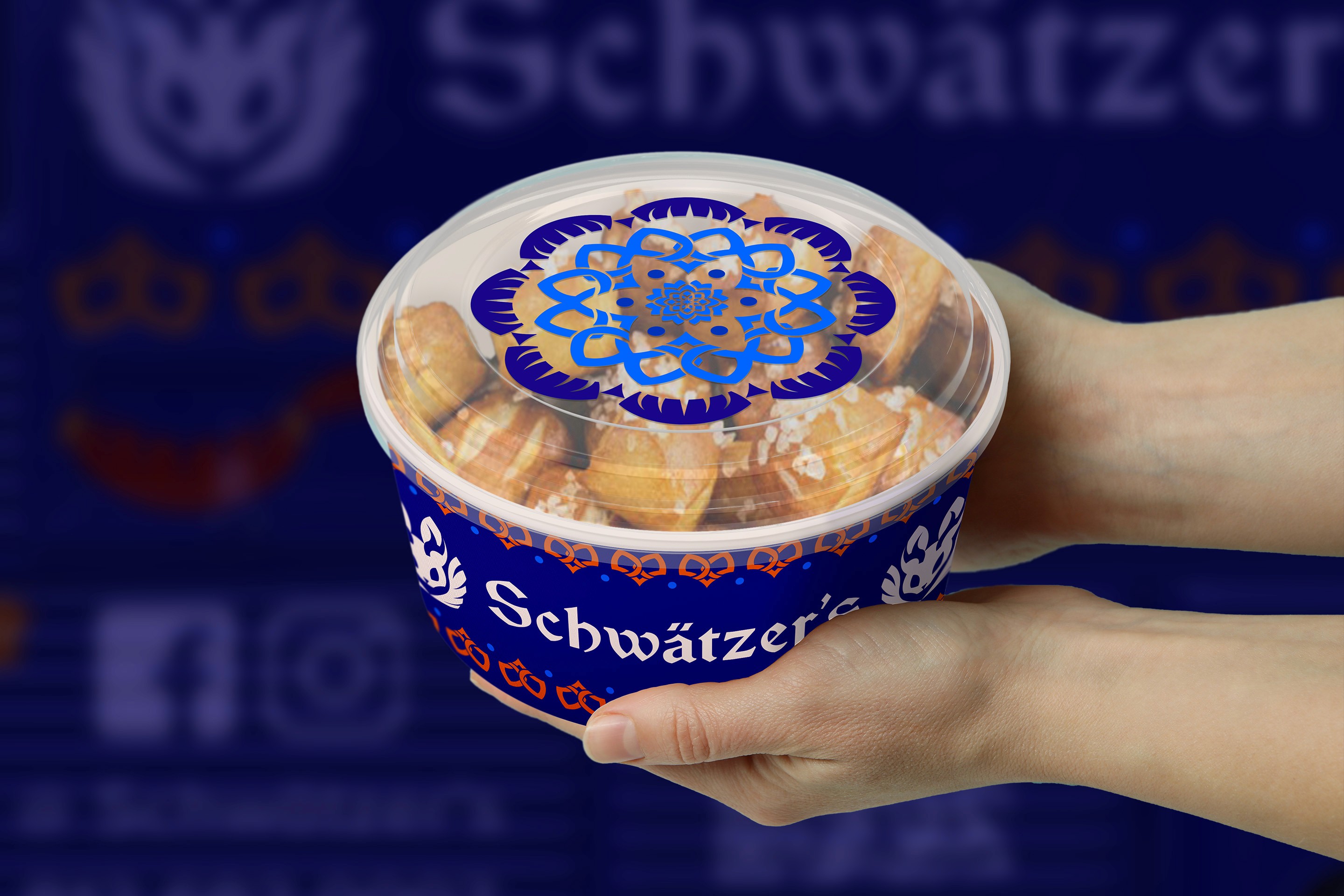
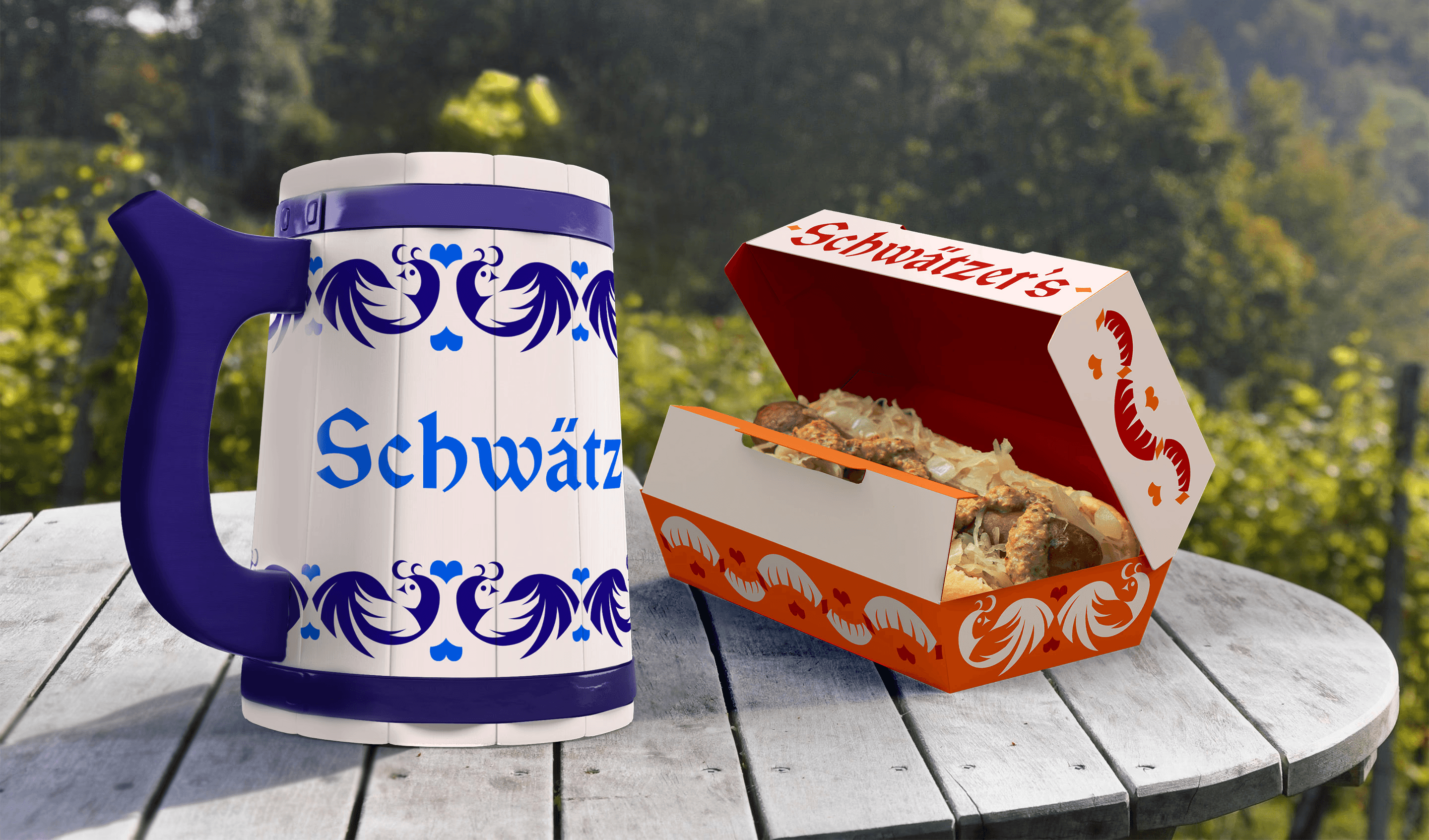
the packaging consists of a reusable beer stein that patrons could purchase for their beverages, to continue the german culture around of alcohol without serving it. the folk art illustrations carried most of the visual weight, keeping the stein feeling festive and traditional. since pretzels and bratwursts are staples in german cuisine, their imagery across the packaging and branding was essential. they were not just illustrations but patterns that continued to mimic german folk art to further the restaurant's roots & history.
the packaging consists of a reusable beer stein that patrons could purchase for their beverages, to continue the german culture around of alcohol without serving it. the folk art illustrations carried most of the visual weight, keeping the stein feeling festive and traditional. since pretzels and bratwursts are staples in german cuisine, their imagery across the packaging and branding was essential. they were not just illustrations but patterns that continued to mimic german folk art to further the restaurant's roots & history.

Packaging
the packaging consists of a reusable beer stein that patrons could purchase for their beverages, to continue the german culture around of alcohol without serving it. the folk art illustrations carried most of the visual weight, keeping the stein feeling festive and traditional. since pretzels and bratwursts are staples in german cuisine, their imagery across the packaging and branding was essential. they were not just illustrations but patterns that continued to mimic german folk art to further the restaurant's roots & history.

Digital Menu
schwätzer's menu consists of popular traditional german cuisine. another feature of the menu is those who know german can switch the language and order. this is due to the restaurant offering german night classes as a way to promote their heritage.
schwätzer's menu consists of popular traditional german cuisine. another feature of the menu is those who know german can switch the language and order. this is due to the restaurant offering german night classes as a way to promote their heritage.
Digital Menu
schwätzer's menu consists of popular traditional german cuisine. another feature of the menu is those who know german can switch the language and order. this is due to the restaurant offering german night classes as a way to promote their heritage.
the results
the constraints of the brief led to better and creative outcomes as a whole. the no-alcohol rule could have felt limiting, but it actually focused the entire identity onto the stronger story: german heritage as the product, with the food as the way it's delivered. the packaging of the world recognition was a good reminder that culturally specific, story-driven design tends to cut through.




Schwätzer's
honoring german heritage one bratwurst at a time
honoring german heritage one bratwurst at a time
honoring german heritage one bratwurst at a time
project scope
brand identity & packaging
my role
Visual Designer
Visual Designer
year
2023
recognition
recognition
the challenge
schwätzer's is a local german restaurant in seymour, indiana, proud of their german roots. they specialized in hand-crafted german cuisine and promote their heritage with nightly german classes. the food truck extension of the brand needed to carry all of that weight while solving a specific design problem: german culture is closely associated with beer and alcohol, but the truck couldn't serve it.
the strategy
the goal was to develop an overall visual identity for the food truck that resonates with the restaurant's culinary style and ethos. this extended the restaurant's branding to the to-go containers, ensuring the visuals seamlessly translate to the truck's compact canvas.
brainstorming
brainstorming
sketches showcasing the brainstorming for a logomark, brand illustrations, and digital menu layouts. the main inspiration for the brand was german folk art which would highlight the heritage the business is so proud of.
sketches showcasing the brainstorming for a logomark, brand illustrations, and digital menu layouts. the main inspiration for the brand was german folk art which would highlight the heritage the business is so proud of.
brainstorming
sketches showcasing the brainstorming for a logomark, brand illustrations, and digital menu layouts. the main inspiration for the brand was german folk art which would highlight the heritage the business is so proud of.
Face of the brand
Face of the brand
the central creative decision of this project was the logomark. german folklore offered a perfect option: the wolpertinger, a mythical creature made up of woodland animals such as deer, hares, pheasants that supposedly resulted from woodland creatures reproducing. it's culturally specific, visually interesting, and has a built-in warmth and uniqueness that fits a restaurant brand perfectly. the wolpertinger gave the brand something most food trucks don't have: a story. when customers ask about the creature on their packaging, the answer teaches them something real about german culture.
the central creative decision of this project was the logomark. german folklore offered a perfect option: the wolpertinger, a mythical creature made up of woodland animals such as deer, hares, pheasants that supposedly resulted from woodland creatures reproducing. it's culturally specific, visually interesting, and has a built-in warmth and uniqueness that fits a restaurant brand perfectly. the wolpertinger gave the brand something most food trucks don't have: a story. when customers ask about the creature on their packaging, the answer teaches them something real about german culture.
Illustration
beyond the logomark, a set of folk art-inspired illustrations were developed from specific cultural imagery: • distelfink - double good luck • pretzel & bratwurst - cuisine • cornflower - resilience & hope • heart - love, affection, & regional pride each illustration was designed to feel hand-crafted and more like folk art than modern commercial illustration to reinforce the restaurant's connection to tradition over trend.
beyond the logomark, a set of folk art-inspired illustrations were developed from specific cultural imagery: • distelfink - double good luck • pretzel & bratwurst - cuisine • cornflower - resilience & hope • heart - love, affection, & regional pride each illustration was designed to feel hand-crafted and more like folk art than modern commercial illustration to reinforce the restaurant's connection to tradition over trend.
Illustration
beyond the logomark, a set of folk art-inspired illustrations were developed from specific cultural imagery: • distelfink - double good luck • pretzel & bratwurst - cuisine • cornflower - resilience & hope • heart - love, affection, & regional pride each illustration was designed to feel hand-crafted and more like folk art than modern commercial illustration to reinforce the restaurant's connection to tradition over trend.
Packaging
the packaging consists of a reusable beer stein that patrons could purchase for their beverages, to continue the german culture around of alcohol without serving it. the folk art illustrations carried most of the visual weight, keeping the stein feeling festive and traditional. since pretzels and bratwursts are staples in german cuisine, their imagery across the packaging and branding was essential. they were not just illustrations but patterns that continued to mimic german folk art to further the restaurant's roots & history.
the packaging consists of a reusable beer stein that patrons could purchase for their beverages, to continue the german culture around of alcohol without serving it. the folk art illustrations carried most of the visual weight, keeping the stein feeling festive and traditional. since pretzels and bratwursts are staples in german cuisine, their imagery across the packaging and branding was essential. they were not just illustrations but patterns that continued to mimic german folk art to further the restaurant's roots & history.
Packaging
the packaging consists of a reusable beer stein that patrons could purchase for their beverages, to continue the german culture around of alcohol without serving it. the folk art illustrations carried most of the visual weight, keeping the stein feeling festive and traditional. since pretzels and bratwursts are staples in german cuisine, their imagery across the packaging and branding was essential. they were not just illustrations but patterns that continued to mimic german folk art to further the restaurant's roots & history.
Digital Menu
schwätzer's menu consists of popular traditional german cuisine. another feature of the menu is those who know german can switch the language and order. this is due to the restaurant offering german night classes as a way to promote their heritage.
schwätzer's menu consists of popular traditional german cuisine. another feature of the menu is those who know german can switch the language and order. this is due to the restaurant offering german night classes as a way to promote their heritage.
Digital Menu
schwätzer's menu consists of popular traditional german cuisine. another feature of the menu is those who know german can switch the language and order. this is due to the restaurant offering german night classes as a way to promote their heritage.
the results
the constraints of the brief led to better and creative outcomes as a whole. the no-alcohol rule could have felt limiting, but it actually focused the entire identity onto the stronger story: german heritage as the product, with the food as the way it's delivered. the packaging of the world recognition was a good reminder that culturally specific, story-driven design tends to cut through.
Schwätzer's
honoring german heritage one bratwurst at a time
honoring german heritage one bratwurst at a time
honoring german heritage one bratwurst at a time
project scope
brand identity & packaging
my role
Visual Designer
Visual Designer
year
2023
recognition
recognition
the challenge
schwätzer's is a local german restaurant in seymour, indiana, proud of their german roots. they specialized in hand-crafted german cuisine and promote their heritage with nightly german classes. the food truck extension of the brand needed to carry all of that weight while solving a specific design problem: german culture is closely associated with beer and alcohol, but the truck couldn't serve it.
the strategy
the goal was to develop an overall visual identity for the food truck that resonates with the restaurant's culinary style and ethos. this extended the restaurant's branding to the to-go containers, ensuring the visuals seamlessly translate to the truck's compact canvas.
brainstorming
brainstorming
sketches showcasing the brainstorming for a logomark, brand illustrations, and digital menu layouts. the main inspiration for the brand was german folk art which would highlight the heritage the business is so proud of.
sketches showcasing the brainstorming for a logomark, brand illustrations, and digital menu layouts. the main inspiration for the brand was german folk art which would highlight the heritage the business is so proud of.
brainstorming
sketches showcasing the brainstorming for a logomark, brand illustrations, and digital menu layouts. the main inspiration for the brand was german folk art which would highlight the heritage the business is so proud of.
Face of the brand
Face of the brand
the central creative decision of this project was the logomark. german folklore offered a perfect option: the wolpertinger, a mythical creature made up of woodland animals such as deer, hares, pheasants that supposedly resulted from woodland creatures reproducing. it's culturally specific, visually interesting, and has a built-in warmth and uniqueness that fits a restaurant brand perfectly. the wolpertinger gave the brand something most food trucks don't have: a story. when customers ask about the creature on their packaging, the answer teaches them something real about german culture.
the central creative decision of this project was the logomark. german folklore offered a perfect option: the wolpertinger, a mythical creature made up of woodland animals such as deer, hares, pheasants that supposedly resulted from woodland creatures reproducing. it's culturally specific, visually interesting, and has a built-in warmth and uniqueness that fits a restaurant brand perfectly. the wolpertinger gave the brand something most food trucks don't have: a story. when customers ask about the creature on their packaging, the answer teaches them something real about german culture.
Illustration
beyond the logomark, a set of folk art-inspired illustrations were developed from specific cultural imagery: • distelfink - double good luck • pretzel & bratwurst - cuisine • cornflower - resilience & hope • heart - love, affection, & regional pride each illustration was designed to feel hand-crafted and more like folk art than modern commercial illustration to reinforce the restaurant's connection to tradition over trend.
beyond the logomark, a set of folk art-inspired illustrations were developed from specific cultural imagery: • distelfink - double good luck • pretzel & bratwurst - cuisine • cornflower - resilience & hope • heart - love, affection, & regional pride each illustration was designed to feel hand-crafted and more like folk art than modern commercial illustration to reinforce the restaurant's connection to tradition over trend.
Illustration
beyond the logomark, a set of folk art-inspired illustrations were developed from specific cultural imagery: • distelfink - double good luck • pretzel & bratwurst - cuisine • cornflower - resilience & hope • heart - love, affection, & regional pride each illustration was designed to feel hand-crafted and more like folk art than modern commercial illustration to reinforce the restaurant's connection to tradition over trend.
Packaging
the packaging consists of a reusable beer stein that patrons could purchase for their beverages, to continue the german culture around of alcohol without serving it. the folk art illustrations carried most of the visual weight, keeping the stein feeling festive and traditional. since pretzels and bratwursts are staples in german cuisine, their imagery across the packaging and branding was essential. they were not just illustrations but patterns that continued to mimic german folk art to further the restaurant's roots & history.
the packaging consists of a reusable beer stein that patrons could purchase for their beverages, to continue the german culture around of alcohol without serving it. the folk art illustrations carried most of the visual weight, keeping the stein feeling festive and traditional. since pretzels and bratwursts are staples in german cuisine, their imagery across the packaging and branding was essential. they were not just illustrations but patterns that continued to mimic german folk art to further the restaurant's roots & history.
Packaging
the packaging consists of a reusable beer stein that patrons could purchase for their beverages, to continue the german culture around of alcohol without serving it. the folk art illustrations carried most of the visual weight, keeping the stein feeling festive and traditional. since pretzels and bratwursts are staples in german cuisine, their imagery across the packaging and branding was essential. they were not just illustrations but patterns that continued to mimic german folk art to further the restaurant's roots & history.
Digital Menu
schwätzer's menu consists of popular traditional german cuisine. another feature of the menu is those who know german can switch the language and order. this is due to the restaurant offering german night classes as a way to promote their heritage.
schwätzer's menu consists of popular traditional german cuisine. another feature of the menu is those who know german can switch the language and order. this is due to the restaurant offering german night classes as a way to promote their heritage.
Digital Menu
schwätzer's menu consists of popular traditional german cuisine. another feature of the menu is those who know german can switch the language and order. this is due to the restaurant offering german night classes as a way to promote their heritage.
the results
the constraints of the brief led to better and creative outcomes as a whole. the no-alcohol rule could have felt limiting, but it actually focused the entire identity onto the stronger story: german heritage as the product, with the food as the way it's delivered. the packaging of the world recognition was a good reminder that culturally specific, story-driven design tends to cut through.