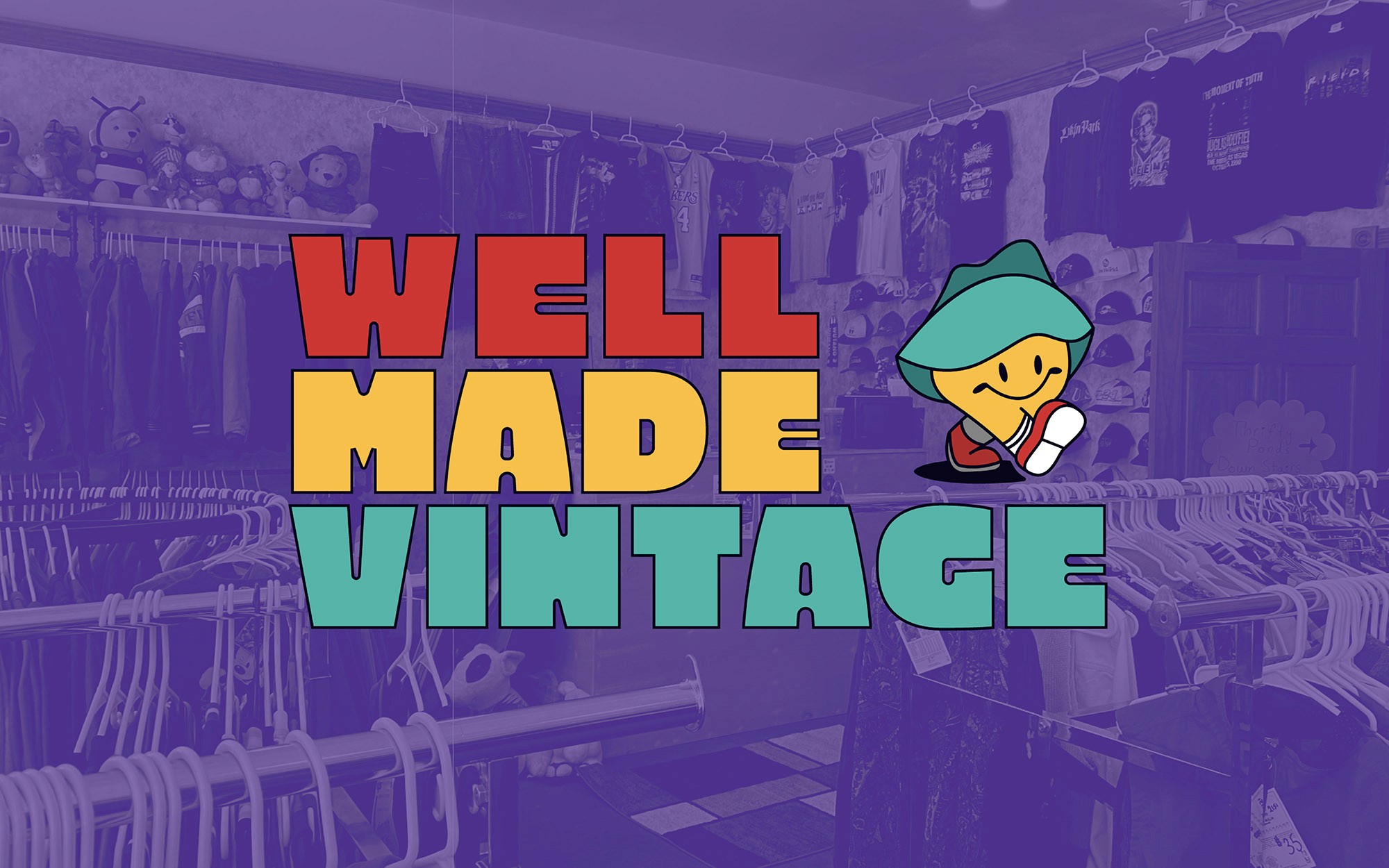
Well Made Vintage
making thrifting feel welcoming to new audiences
making thrifting feel welcoming to new audiences
making thrifting feel welcoming to new audiences
project scope
branding / visual identity
my role
Brand designer
Brand designer
the challenge
Well Made Vintage is a second-hand retail business in Muncie, Indiana who has now branched out to Indianapolis and Chicago. The establishment specializes in apparel and memorabilia from the 70s, 80s, 90s, and early 2000s but needed an identity to reflect the retro taste they want to provide to their customers, seasoned or new to the realm of thrifting.
the strategy
the goal was to develop a complete brand identity for well made vintage that resonates with their company’s goal and mission to share their love for all things retro. this led to the idea of having an approachable mascot to make the scene less intimidating for new comers and welcoming to those familiar with the style.
brainstorming
brainstorming
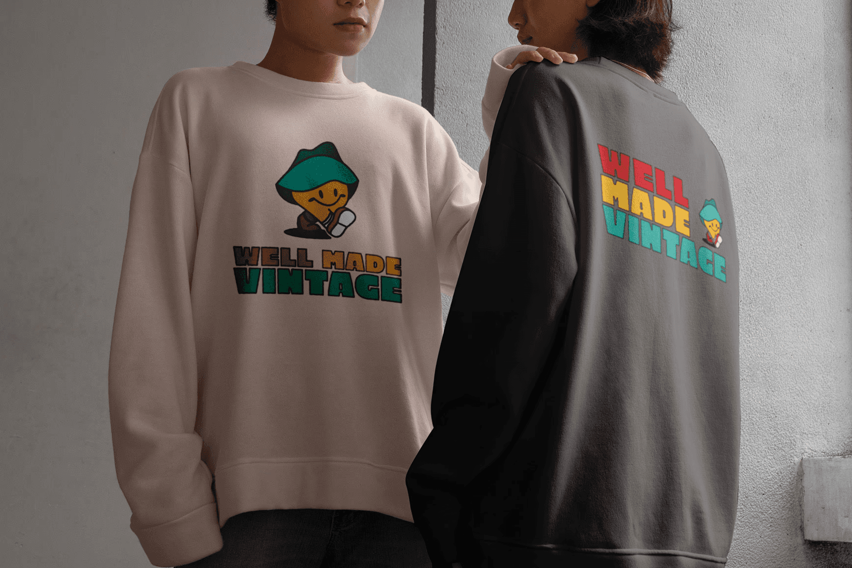
sketches showcasing the brainstorming of the brand identity for well made vintage. the concept of thrifting something is to reuse something second-hand rather than buying brand new. ideas of this can be seen from the sketches. another direction was to use a friendly mascot to make patrons feel comfortable and trusting the business and its practice.
sketches showcasing the brainstorming of the brand identity for well made vintage. the concept of thrifting something is to reuse something second-hand rather than buying brand new. ideas of this can be seen from the sketches. another direction was to use a friendly mascot to make patrons feel comfortable and trusting the business and its practice.
brainstorming
sketches showcasing the brainstorming of the brand identity for well made vintage. the concept of thrifting something is to reuse something second-hand rather than buying brand new. ideas of this can be seen from the sketches. another direction was to use a friendly mascot to make patrons feel comfortable and trusting the business and its practice.



Face of the brand
Face of the brand
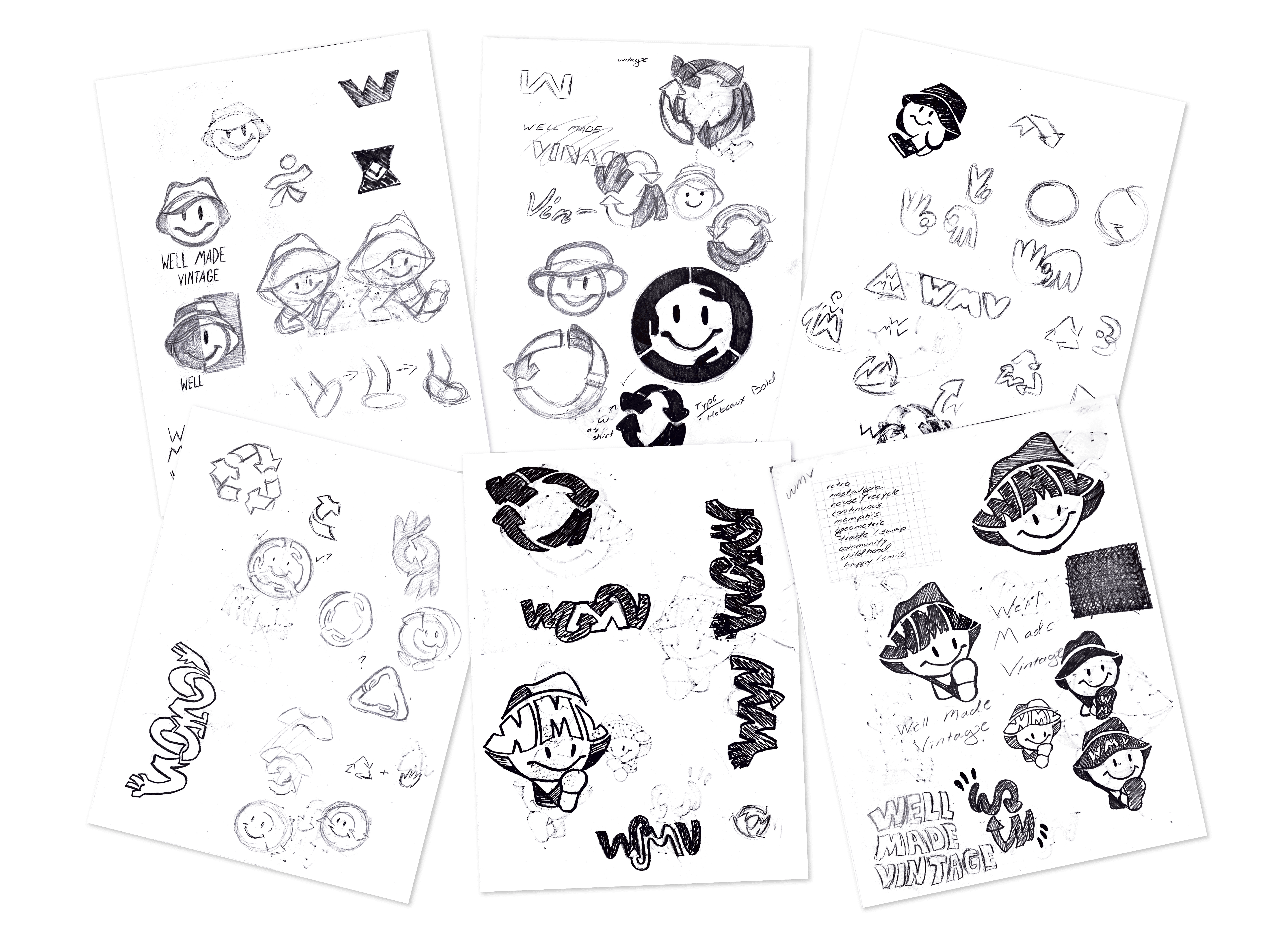
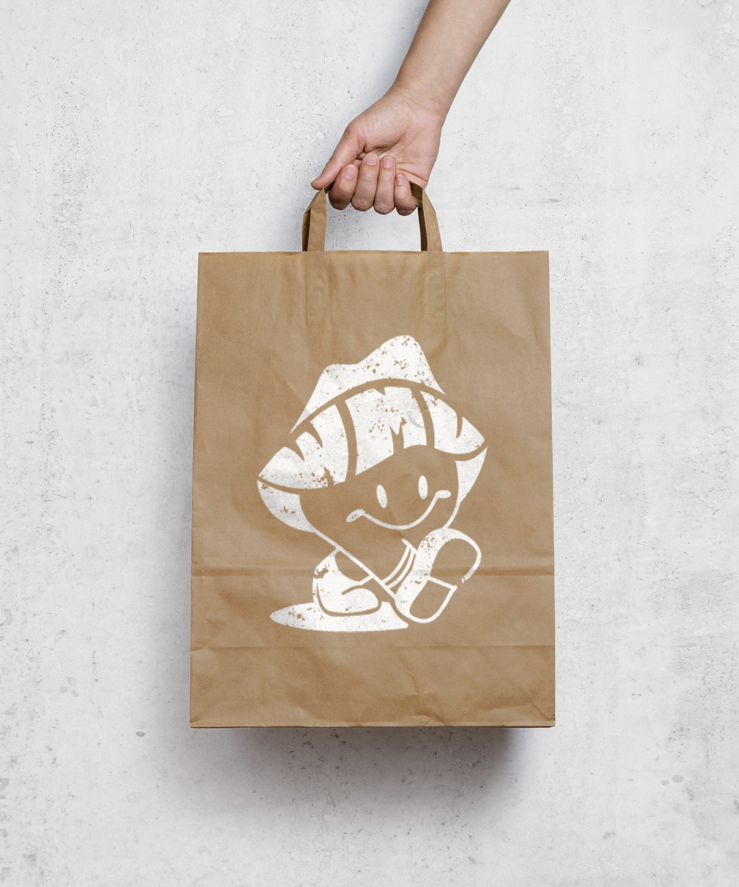
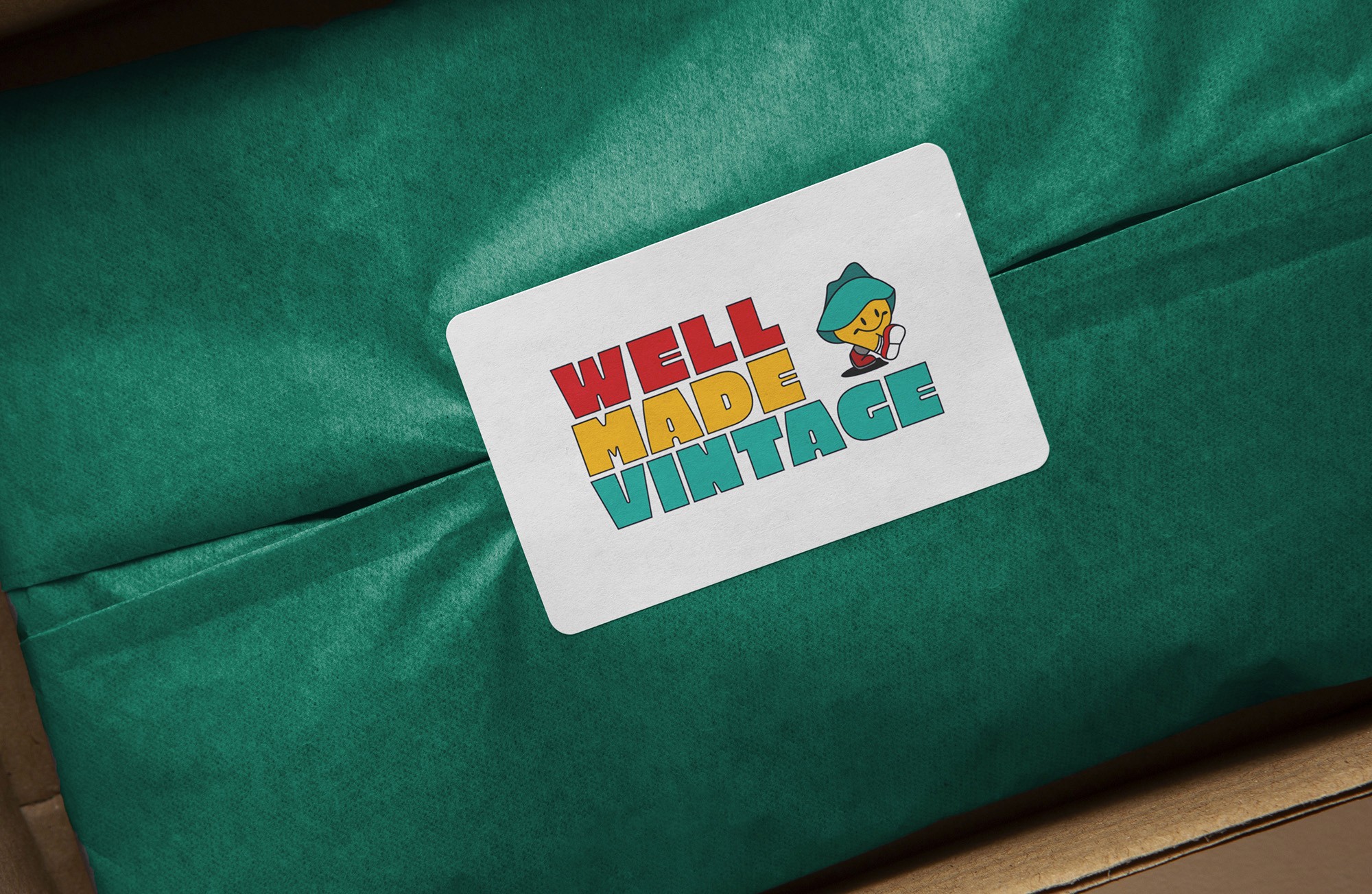
vinny - short for "vintage" was designed to be a familiar face to those new to well made vintage. he was designed with deliberate details: a bucket hat (iconic 90s accessory), yellow smiley face (the universal symbol of approachability, deeply embedded in retro culture), and converse chuck taylors (timeless, and cross-generational).
vinny - short for "vintage" was designed to be a familiar face to those new to well made vintage. he was designed with deliberate details: a bucket hat (iconic 90s accessory), yellow smiley face (the universal symbol of approachability, deeply embedded in retro culture), and converse chuck taylors (timeless, and cross-generational).
Brand Identity
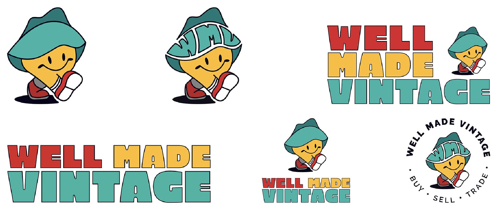
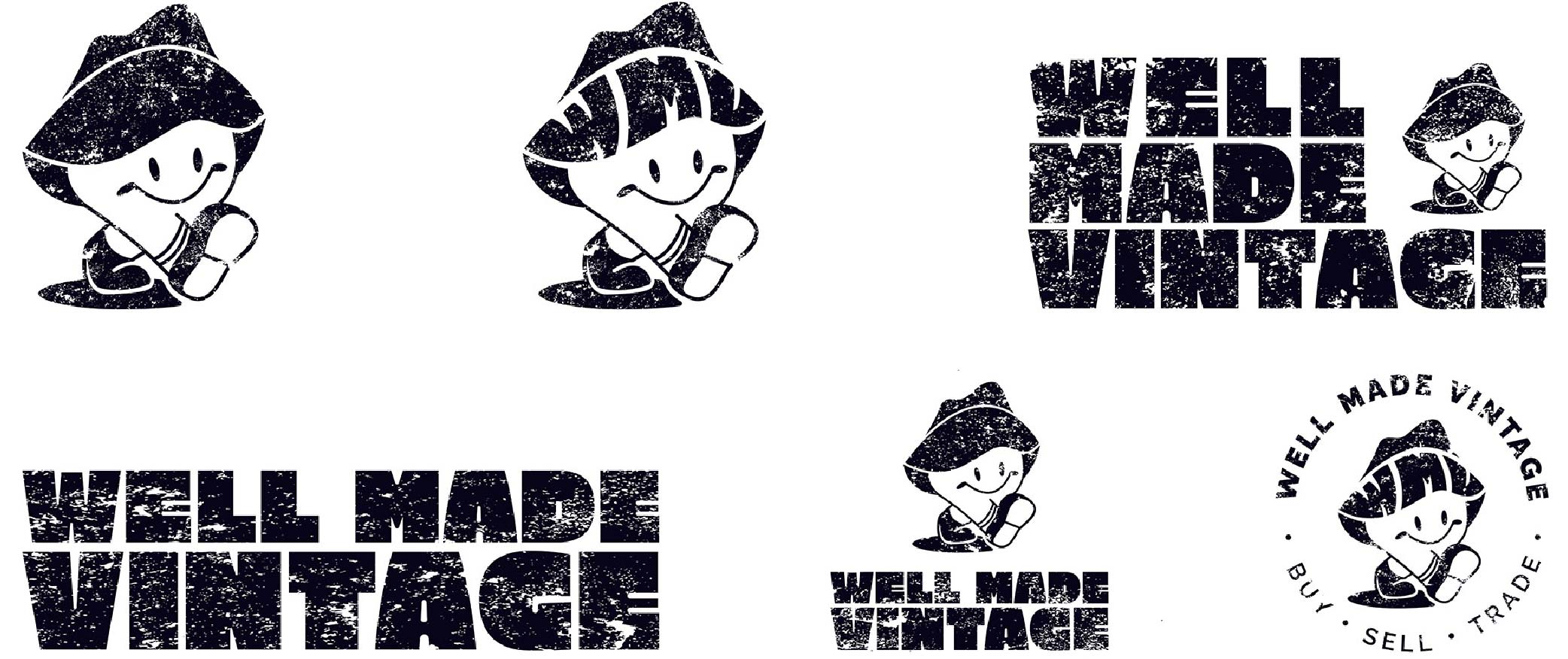
expanding from muncie to indianapolis and chicago meant the brand system needed to scale. a full identity suite was developed that includes primary and secondary lockups, usage guidelines, color variations, & supporting assets. this provides well made vintage flexibility without fragmentation. the suite was designed with future touchpoints in mind: social content, signage, merchandise, and potential e-commerce.
expanding from muncie to indianapolis and chicago meant the brand system needed to scale. a full identity suite was developed that includes primary and secondary lockups, usage guidelines, color variations, & supporting assets. this provides well made vintage flexibility without fragmentation. the suite was designed with future touchpoints in mind: social content, signage, merchandise, and potential e-commerce.
Brand Identity
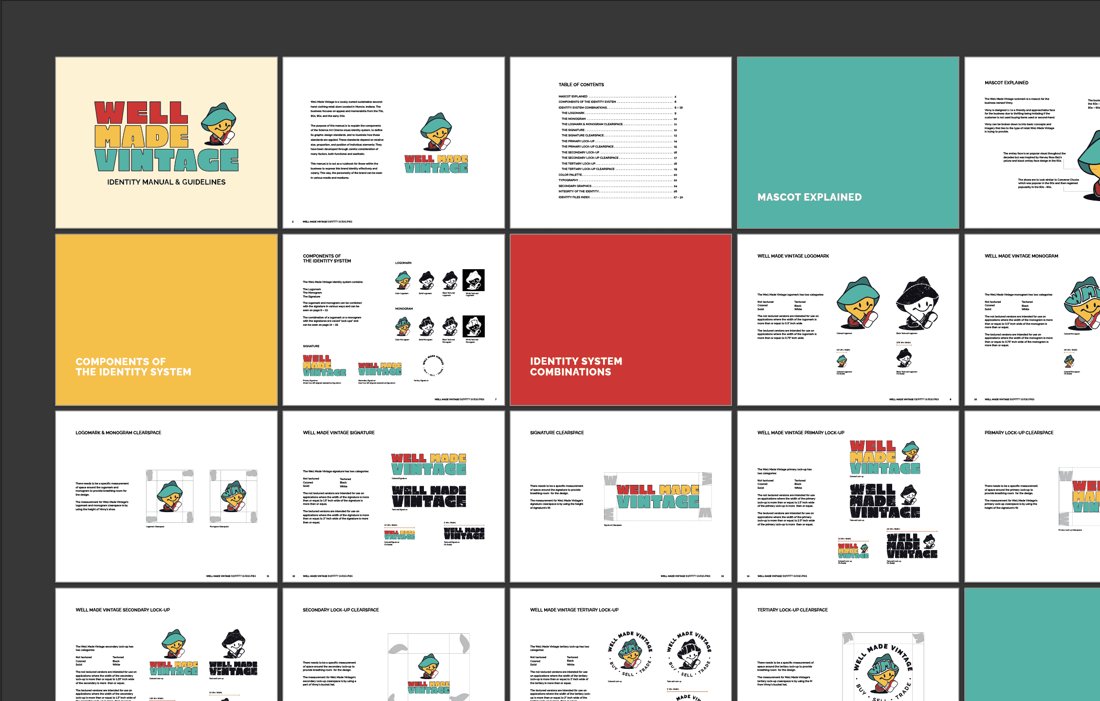
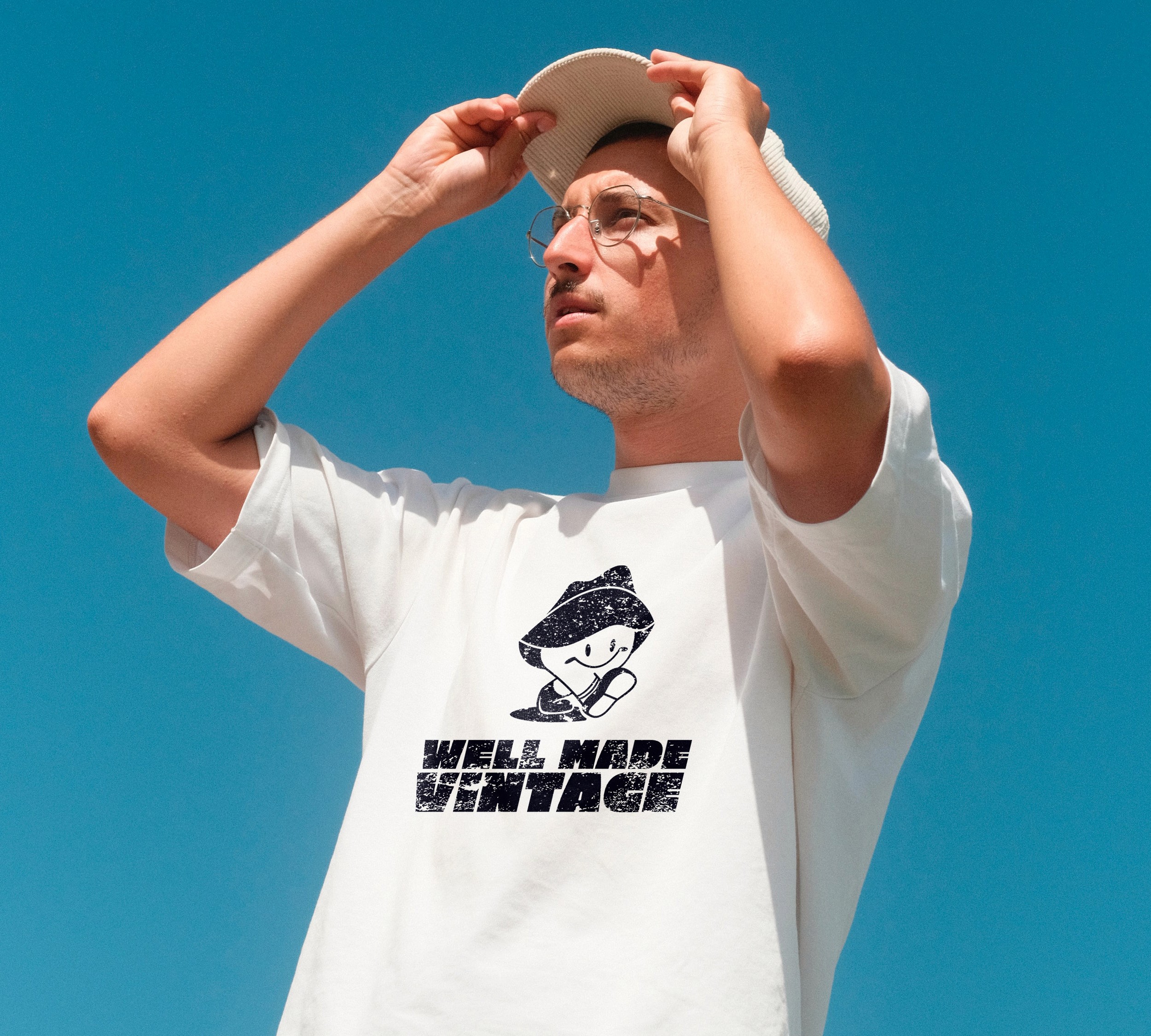
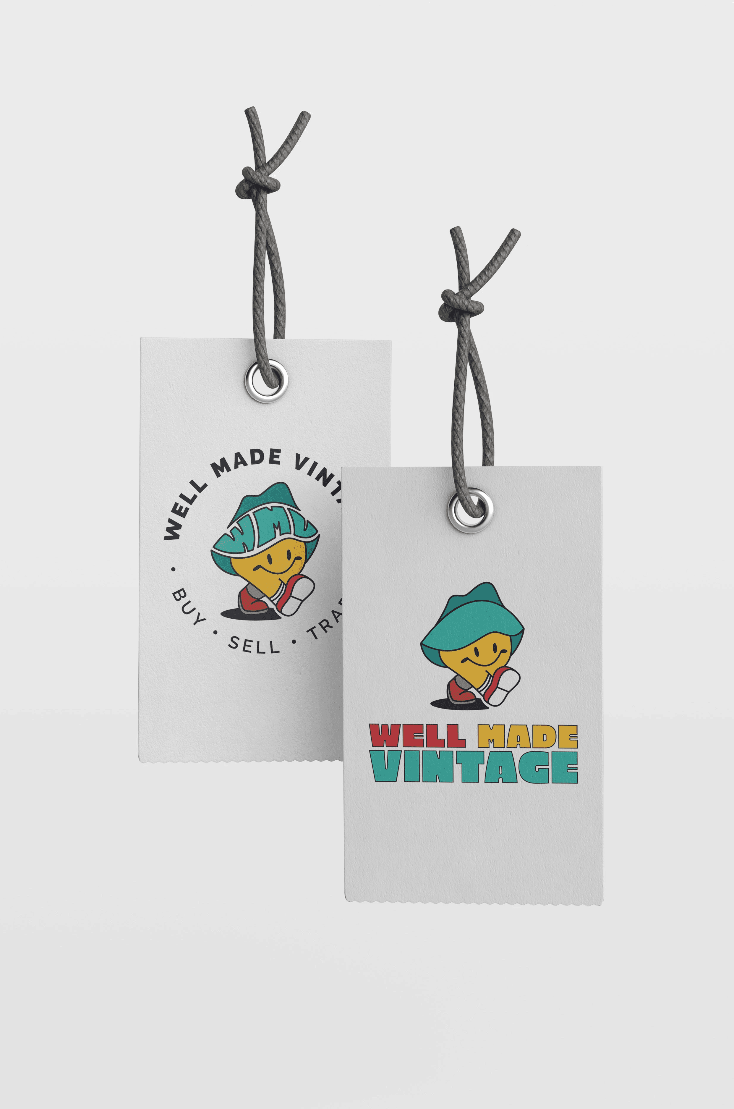
expanding from muncie to indianapolis and chicago meant the brand system needed to scale. a full identity suite was developed that includes primary and secondary lockups, usage guidelines, color variations, & supporting assets. this provides well made vintage flexibility without fragmentation. the suite was designed with future touchpoints in mind: social content, signage, merchandise, and potential e-commerce.
the results
mascot design is deceptively complex. "cute and approachable" sounds like a low bar, but getting to a character that's genuinely ownable that feels specific to this brand rather than generic requires a lot of iteration. the details (why these cultural signifiers, why this color family) are what separate a mascot from just a cartoon.



Well Made Vintage
making thrifting feel welcoming to new audiences
making thrifting feel welcoming to new audiences
making thrifting feel welcoming to new audiences
project scope
branding / visual identity
my role
Brand designer
Brand designer
the challenge
Well Made Vintage is a second-hand retail business in Muncie, Indiana who has now branched out to Indianapolis and Chicago. The establishment specializes in apparel and memorabilia from the 70s, 80s, 90s, and early 2000s but needed an identity to reflect the retro taste they want to provide to their customers, seasoned or new to the realm of thrifting.
the strategy
the goal was to develop a complete brand identity for well made vintage that resonates with their company’s goal and mission to share their love for all things retro. this led to the idea of having an approachable mascot to make the scene less intimidating for new comers and welcoming to those familiar with the style.
brainstorming
brainstorming
sketches showcasing the brainstorming of the brand identity for well made vintage. the concept of thrifting something is to reuse something second-hand rather than buying brand new. ideas of this can be seen from the sketches. another direction was to use a friendly mascot to make patrons feel comfortable and trusting the business and its practice.
sketches showcasing the brainstorming of the brand identity for well made vintage. the concept of thrifting something is to reuse something second-hand rather than buying brand new. ideas of this can be seen from the sketches. another direction was to use a friendly mascot to make patrons feel comfortable and trusting the business and its practice.
brainstorming
sketches showcasing the brainstorming of the brand identity for well made vintage. the concept of thrifting something is to reuse something second-hand rather than buying brand new. ideas of this can be seen from the sketches. another direction was to use a friendly mascot to make patrons feel comfortable and trusting the business and its practice.
Face of the brand
Face of the brand
vinny - short for "vintage" was designed to be a familiar face to those new to well made vintage. he was designed with deliberate details: a bucket hat (iconic 90s accessory), yellow smiley face (the universal symbol of approachability, deeply embedded in retro culture), and converse chuck taylors (timeless, and cross-generational).
vinny - short for "vintage" was designed to be a familiar face to those new to well made vintage. he was designed with deliberate details: a bucket hat (iconic 90s accessory), yellow smiley face (the universal symbol of approachability, deeply embedded in retro culture), and converse chuck taylors (timeless, and cross-generational).
Brand Identity
expanding from muncie to indianapolis and chicago meant the brand system needed to scale. a full identity suite was developed that includes primary and secondary lockups, usage guidelines, color variations, & supporting assets. this provides well made vintage flexibility without fragmentation. the suite was designed with future touchpoints in mind: social content, signage, merchandise, and potential e-commerce.
expanding from muncie to indianapolis and chicago meant the brand system needed to scale. a full identity suite was developed that includes primary and secondary lockups, usage guidelines, color variations, & supporting assets. this provides well made vintage flexibility without fragmentation. the suite was designed with future touchpoints in mind: social content, signage, merchandise, and potential e-commerce.
Brand Identity
expanding from muncie to indianapolis and chicago meant the brand system needed to scale. a full identity suite was developed that includes primary and secondary lockups, usage guidelines, color variations, & supporting assets. this provides well made vintage flexibility without fragmentation. the suite was designed with future touchpoints in mind: social content, signage, merchandise, and potential e-commerce.
the results
mascot design is deceptively complex. "cute and approachable" sounds like a low bar, but getting to a character that's genuinely ownable that feels specific to this brand rather than generic requires a lot of iteration. the details (why these cultural signifiers, why this color family) are what separate a mascot from just a cartoon.
Well Made Vintage
making thrifting feel welcoming to new audiences
making thrifting feel welcoming to new audiences
making thrifting feel welcoming to new audiences
project scope
branding / visual identity
my role
Brand designer
Brand designer
the challenge
Well Made Vintage is a second-hand retail business in Muncie, Indiana who has now branched out to Indianapolis and Chicago. The establishment specializes in apparel and memorabilia from the 70s, 80s, 90s, and early 2000s but needed an identity to reflect the retro taste they want to provide to their customers, seasoned or new to the realm of thrifting.
the strategy
the goal was to develop a complete brand identity for well made vintage that resonates with their company’s goal and mission to share their love for all things retro. this led to the idea of having an approachable mascot to make the scene less intimidating for new comers and welcoming to those familiar with the style.
brainstorming
brainstorming
sketches showcasing the brainstorming of the brand identity for well made vintage. the concept of thrifting something is to reuse something second-hand rather than buying brand new. ideas of this can be seen from the sketches. another direction was to use a friendly mascot to make patrons feel comfortable and trusting the business and its practice.
sketches showcasing the brainstorming of the brand identity for well made vintage. the concept of thrifting something is to reuse something second-hand rather than buying brand new. ideas of this can be seen from the sketches. another direction was to use a friendly mascot to make patrons feel comfortable and trusting the business and its practice.
brainstorming
sketches showcasing the brainstorming of the brand identity for well made vintage. the concept of thrifting something is to reuse something second-hand rather than buying brand new. ideas of this can be seen from the sketches. another direction was to use a friendly mascot to make patrons feel comfortable and trusting the business and its practice.
Face of the brand
Face of the brand
vinny - short for "vintage" was designed to be a familiar face to those new to well made vintage. he was designed with deliberate details: a bucket hat (iconic 90s accessory), yellow smiley face (the universal symbol of approachability, deeply embedded in retro culture), and converse chuck taylors (timeless, and cross-generational).
vinny - short for "vintage" was designed to be a familiar face to those new to well made vintage. he was designed with deliberate details: a bucket hat (iconic 90s accessory), yellow smiley face (the universal symbol of approachability, deeply embedded in retro culture), and converse chuck taylors (timeless, and cross-generational).
Brand Identity
expanding from muncie to indianapolis and chicago meant the brand system needed to scale. a full identity suite was developed that includes primary and secondary lockups, usage guidelines, color variations, & supporting assets. this provides well made vintage flexibility without fragmentation. the suite was designed with future touchpoints in mind: social content, signage, merchandise, and potential e-commerce.
expanding from muncie to indianapolis and chicago meant the brand system needed to scale. a full identity suite was developed that includes primary and secondary lockups, usage guidelines, color variations, & supporting assets. this provides well made vintage flexibility without fragmentation. the suite was designed with future touchpoints in mind: social content, signage, merchandise, and potential e-commerce.
Brand Identity
expanding from muncie to indianapolis and chicago meant the brand system needed to scale. a full identity suite was developed that includes primary and secondary lockups, usage guidelines, color variations, & supporting assets. this provides well made vintage flexibility without fragmentation. the suite was designed with future touchpoints in mind: social content, signage, merchandise, and potential e-commerce.
the results
mascot design is deceptively complex. "cute and approachable" sounds like a low bar, but getting to a character that's genuinely ownable that feels specific to this brand rather than generic requires a lot of iteration. the details (why these cultural signifiers, why this color family) are what separate a mascot from just a cartoon.